Typography:Task1 Type Expression and Formatting
25.9.2023
You Siyuan/0366978/179953983
Typography/Design in Creative Media
Task1
TABLE OF CONTENTS
1. Lectures
2. Instructions
3. Task 1
4. Feedback
5. Reflections
6. Further Reading
LECTURES
Week1 Introduction
It mainly talks about the art and technique of typesetting, and how the
written language can be more readable, easy to read and attractive when
displayed. Font All fonts/fonts with similar features/styles.

The use of upper and lower case stems from the habit of writing the first letter of words and sentences larger, and later these larger letters were unified into the font used in ancient Greece and Rome, that is, we know the capital letter, and the rules for the use of upper and lower case letters were gradually unified in the past three hundred years, so it also caused different rules of upper and lower case in different languages.
1450 Blackletter
The earliest printing type, its forms were based upon the hand-copying
styles that were then used for books in northern Europe.
1475 Oldstyle
Based upon the lowercase forms used by ltalian humanist scholarsfor book
copying (themselves based upon the ninth-century Carolineminisule) and the
uppercase letterforms found inscribed on Romanruins, the forms evolved away
from their calligraphic origins over 200years, as they migrated across
europe, from ltaly to England.
Echoing contemporary ltalian handwriting, the first italics werecondensed and
close-set, allowing more words per page. Althoughoriginally considered their
own class of type, italics were soon cast tocomplement roman forms. Since the
sixteenth century, virtually all texttypefaces have been designed with
accompanying italic forms.
1550 ScriptOriginally and attempt to replicate engraved calligraphic forms,
thisclass of type is not entirely appropriate in lengthy text settings.
Inshorter applications,however, it has always enjoyed wideacceptance. Forms
now range from the formal and traditional to thecasual and contemporary.
1750 Transitional
A refinement of oldstyle forms, this style was achieved in partbecause of
advances in casting and printing. Thick to thinrelationships were
exaggerated, and braokets were lightened.
1775 Modern
Serifs are unbracketed, and the contrast between thick and thin are extreme.
1825 Square Serif / Slab Serif
Unbracketed with little variation between thick and thin strokes.
1900 Sans Serif
Eliminated serifs.
1990 Serif / Sans Serif
Includes both serif and sans serif alphabets.
Week2 Basic
In order to identify a particular font, it is necessary to understand the
components of a font.
Baseline:
Visual base (imaginary) of the letterforms.
Median:
(lmaginary) line defining the x-height of letterforms.
X-height:
The height of the lowercase 'x'.
Stroke:
Any line that defines the basic letterform.
Apex/Vertex:
Point created by ioining two diagonal stems
Arm:
Short strokes off the stem of the letterform.
Ascender:
Portion of the stem of a lowercase letterform that projects above the median
line.
Barb:
Half-serif finish on some curved stroke.
Beak:
Half-serif finish on some horizontal arms
Bowl:
Rounded form that describes a counter.
Bracket:
Transition between the serif and stem.
Cross Bar:
Horizontal stroke in a letterform that joins two stems together.
Cross Stroke:
Horizontal stroke in a letterform that joins two stems together.
Crotch:
Interior space where two strokes meet.
Descender:
Portion of the stem of a lowercase form that projects below the baseline.
Ear:
Stroke extending out from the main stem or the body of the letter form.
Em:
Distance equal to the size of the typeface
En:
Half of the em.
Finial:
Rounded non-serif terminal to a stroke.
Ligature:
Character formed by the combination of two or more letterforms.
Link:
Stroke connecting the bowl and the loop of a lowercase G.
Loop:
Bowl created in the descender of the lowercase G (in some typefaces)
Serif:
Right-angled or oblique foot at the end of the stroke.
Shoulder:
Curved stroke that is not part of a bowl.
Spine:
Curved stem of the S.
Spur:
Extension the articulates the junction of the curved and rectilinear stroke.
Stem:
The significant vertical or oblique stroke.
Stress:
Orientation of the letterform, indicated by the thin stroke in round forms.
Swash:
The flourish that extends the stroke of the letterform.
Tail:
The curved diagonal stroke at the finish of certain letterforms.
Terminal:
Selfcontained finish of a stroke without a serif.
Fonts are divided into upper and lower case, small capital letters, upper and
lower case numbers, italics & Roman, punctuation and miscellaneous
characters, ornaments.
The described fonts are Roman & italic, blackface and light, condensed and
expanded.
Week3 Text
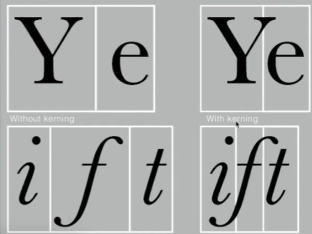
Kerning is the automatic adjustment of the spacing between letters. It is
often incorrectly referred to as "letterspacing". In practice, letter spacing
means adding space between letters. Adding or removing Spaces in words or
sentences is called "tracking."

Legibility is always the most important thing.
Flush left
Centered
Flush right
Justified
Different fonts are suitable for different messages. A good typographer must
know which font is best for the information at hand. Fonts with relatively
large x-heights or stroke widths produce darker quality on the page than fonts
with relatively small x-heights or lighter strokes. Sensitivity to these color
differences is fundamental to creating successful layouts.
Type size:
Text type should be large enough to be read easily atarms length-imagine
yourself holding a book in your lap.
Leading:
Text that is set too tightly encourages vertical eyemovement; a reader can
easily loose his or her place. Type that is settoo loosely creates striped
patterns that distract the reader from thematerial at hand.
Line Length:
Appropriate leading for text is as much a function of theline length as it
is a question of type size and leading. Shorter linesrequire less leading;
longer lines more. A good rule of thumb is tokeep line length between 55-65
characters. Extremely long or shortlines lengths impairs reading.
Week4 Text
Extended paragraph
Pilcrow Relics of medieval manuscripts.
Paragraph spacing When the size of the line spacing and paragraph spacing
are the same, cross alignment is implemented.
Indentation is usually the same size of the line spacing or dot of the
text.
Widow is a short line of type left alone at the end of a column oftext.
Orphan is a short line of type left alone at the start of new column.
Different ways to emphasize the text are: italics, bold, bold + changing
the font (note :sans serifs usually look larger than serifs), or changing
the color. Another way to highlight text is to place a colored area to
emphasize the text. Different methods are: italic, bold, bold + change the
font (note :sans serifs usually look larger than serifs), or change the
color. Another way to highlight text is to place a colored area behind the
text.
Week5 Letters
Designers design letters with subtle or obvious changes in detail, so
contrast is the most powerful driving force in design.

Instructions
Task 1
Week1-lecture1

The first one is that when a match burns, it matches the meaning of the word
and has a shape similar to the letter i, so I replace i with a match.
The second one, when I thought about the state of a fire burning something,
I added the flame as if it were burning something.
The third one, I wanted to reflect the character itself, so I drew the
letters in the shape of fire.

The first thing I want to show is that this word is cold, so I added the
element of snow to indicate it.
The second one, with ice blocks around the word, indicates that it can turn
into ice.
The third one, I want to express the process of freezing. The light color on
top indicates that it has already formed ice, while the light color on the
bottom indicates that it has not yet formed ice.

The first one, I thought of the splattered blood that was shot at, so I used a
spray gun to draw a picture of the splattered blood at the end of the
character.
Secondly, I directly incorporated gun and bullet elements into the font to
represent the meaning of this word.
The third one, thinking of the single holes left after shooting, combined them
into this word.

The first one, I thought of what electricity looks like, so I drew it as this
word.
The second one, I want to go back to seeing thunder on rainy days, so I added
the appearance of dark clouds and thunder.
The third one, I realized that people often use patch panels to charge, so I
incorporated it into the letters.


Week2

Week3

Week4

Did the teacher tell you how to set up illustrations.
Week5


This week's assignment is similar to last week's, but the title and content
are divided into two parts.
Week6

Feedback
Week1 Do a good blog and provide links to the typesetting page. Each section of the blog is clearly defined.
Week2 Use mind maps for adequate word exploration. Better designs and suitable fonts can be chosen for digitization.
Specific feedback: The word "scream" conjures up a sense of horror, which is good.
Week 3 Talked about things like understanding words and designing fonts.I learned to type according to the meaning of the words.
Week4 General feedback: We are encouraged to read at least 2-3 books and record them in the blog section before further reading.
Specific feedback: I think the lecture was very good. My teacher encouraged me to keep this for future assignments. For gif animations, this can be improved by showing a conversion from the original font and then a wobble effect.
Wee5 General feedback: Text formatting is done using InDesign. Update me for further reading and mention the dates in that part.Specific feedback: Adjust font spacing to add neatness to the article.
THE REFLECTIONS
Week1
I found that the first week of online learning was not as difficult as I had expected.
We know the tools and styles to use them in Illustrator, for example.
Week2
Got feedback from the lecturer on my first few designs and we posted them in our e-portfolio.Learn how to make GIFs from the designs we made in Photoshop. The lecturer gave us a demonstration.
Week3
We learned how to make my name in different fonts.I learned how to use fonts and proper point sizes. Grids and columns also help keep your work clean.
Week4
I learned more about how to use InDesign to help me align text and paragraphs correctly. I had previous experience with Adobe Photoshop and Illustrator, but with the new knowledge provided by the instructor, the students came up with many new ideas. Their advice is well worth learning from.
Ragging, orphans and widows are bad things in text formats. Small details can make a huge difference when reading the words we put in.
Understand the appropriate point size for the subtext and how much you need to add to the lead based on the point size. Understand the maximum number of characters per line. Last but not least, I understand that when you do text alignment properly, your article will be very neat.
FURTHER READING
THE FUNDAMENTAL OF TYPOGRAPHY
by Ambrose, Gavin, Harris, Paul
by Ambrose, Gavin, Harris, Paul
This book tells the story of how typography itself evolved to what it
is today. It begins with phonetic symbols, ideographs, symbols,
hieroglyphs, and ICONS, all of which are believed to have been used in
writing systems throughout human life. Some are still in use today. The
book states that "the Phoenicians were responsible for the development
of mankind's greatest invention". The book also discusses the origins of
genre and shows how it has evolved over time, providing a foundation for
how we prescribe the information we receive. I also learned some
typography terms and some terms similar to what I learned in class.


Comments
Post a Comment