Typography: Final Compilation & Reflection
25/04/2024 - 23/07/2024 (Week 1 - Week 14)
You Siyuan/0366978
Typography / Bachelor of Design in Creative Media
Final compilation and reflection
Instructions
Task 1 Exercises
TABLE OF CONTENTS
1. Lectures
2. Instruction
3. Process work
4. Feedback
5. Reflections
Lectures
Lecture1:Introduction
It mainly talks about the art and technique of typesetting, and how the written language can be more readable, easy to read and attractive when displayed. Font All fonts/fonts with similar features/styles.

The use of upper and lower case stems from the habit of writing the first letter of words and sentences larger, and later these larger letters were unified into the font used in ancient Greece and Rome, that is, we know the capital letter, and the rules for the use of upper and lower case letters were gradually unified in the past three hundred years, so it also caused different rules of upper and lower case in different languages.
1450 Blackletter
The earliest printing type, its forms were based upon the hand-copying styles that were then used for books in northern Europe.
1475 Oldstyle
Based upon the lowercase forms used by ltalian humanist scholarsfor book copying (themselves based upon the ninth-century Carolineminisule) and the uppercase letterforms found inscribed on Romanruins, the forms evolved away from their calligraphic origins over 200years, as they migrated across europe, from ltaly to England.
Echoing contemporary ltalian handwriting, the first italics werecondensed and close-set, allowing more words per page. Althoughoriginally considered their own class of type, italics were soon cast tocomplement roman forms. Since the sixteenth century, virtually all texttypefaces have been designed with accompanying italic forms.
1550 ScriptOriginally and attempt to replicate engraved calligraphic forms, thisclass of type is not entirely appropriate in lengthy text settings. Inshorter applications,however, it has always enjoyed wideacceptance. Forms now range from the formal and traditional to thecasual and contemporary.
1750 Transitional
A refinement of oldstyle forms, this style was achieved in partbecause of advances in casting and printing. Thick to thinrelationships were exaggerated, and braokets were lightened.
1775 Modern
Serifs are unbracketed, and the contrast between thick and thin are extreme.
1825 Square Serif / Slab Serif
Unbracketed with little variation between thick and thin strokes.
1900 Sans Serif
Eliminated serifs.
1990 Serif / Sans Serif
Includes both serif and sans serif alphabets.
Lecture2: Development
In order to identify a particular font, it is necessary to understand the components of a font.
Baseline:
Visual base (imaginary) of the letterforms.
Median:
(lmaginary) line defining the x-height of letterforms.
X-height:
The height of the lowercase 'x'.
Stroke:
Any line that defines the basic letterform.
Apex/Vertex:
Point created by ioining two diagonal stems
Arm:
Short strokes off the stem of the letterform.
Ascender:
Portion of the stem of a lowercase letterform that projects above the median line.
Barb:
Half-serif finish on some curved stroke.
Beak:
Half-serif finish on some horizontal arms
Bowl:
Rounded form that describes a counter.
Bracket:
Transition between the serif and stem.
Cross Bar:
Horizontal stroke in a letterform that joins two stems together.
Cross Stroke:
Horizontal stroke in a letterform that joins two stems together.
Crotch:
Interior space where two strokes meet.
Descender:
Portion of the stem of a lowercase form that projects below the baseline.
Ear:
Stroke extending out from the main stem or the body of the letter form.
Em:
Distance equal to the size of the typeface
En:
Half of the em.
Finial:
Rounded non-serif terminal to a stroke.
Ligature:
Character formed by the combination of two or more letterforms.
Link:
Stroke connecting the bowl and the loop of a lowercase G.
Loop:
Bowl created in the descender of the lowercase G (in some typefaces)
Serif:
Right-angled or oblique foot at the end of the stroke.
Shoulder:
Curved stroke that is not part of a bowl.
Spine:
Curved stem of the S.
Spur:
Extension the articulates the junction of the curved and rectilinear stroke.
Stem:
The significant vertical or oblique stroke.
Stress:
Orientation of the letterform, indicated by the thin stroke in round forms.
Swash:
The flourish that extends the stroke of the letterform.
Tail:
The curved diagonal stroke at the finish of certain letterforms.
Terminal:
Selfcontained finish of a stroke without a serif.
Fonts are divided into upper and lower case, small capital letters, upper and lower case numbers, italics & Roman, punctuation and miscellaneous characters, ornaments.
The described fonts are Roman & italic, blackface and light, condensed and expanded.
Lecture3:Text
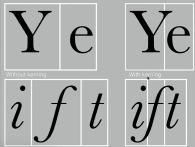
Kerning is the automatic adjustment of the spacing between letters. It is often incorrectly referred to as "letterspacing". In practice, letter spacing means adding space between letters. Adding or removing Spaces in words or sentences is called "tracking."

Legibility is always the most important thing.
Flush left
Centered
Flush right
Justified
Different fonts are suitable for different messages. A good typographer must know which font is best for the information at hand. Fonts with relatively large x-heights or stroke widths produce darker quality on the page than fonts with relatively small x-heights or lighter strokes. Sensitivity to these color differences is fundamental to creating successful layouts.
Type size:
Text type should be large enough to be read easily atarms length-imagine yourself holding a book in your lap.
Leading:
Text that is set too tightly encourages vertical eyemovement; a reader can easily loose his or her place. Type that is settoo loosely creates striped patterns that distract the reader from thematerial at hand.
Line Length:
Appropriate leading for text is as much a function of theline length as it is a question of type size and leading. Shorter linesrequire less leading; longer lines more. A good rule of thumb is tokeep line length between 55-65 characters. Extremely long or shortlines lengths impairs reading.
Lecture4:Text(2)
Extended paragraph
Pilcrow Relics of medieval manuscripts.
Paragraph spacing When the size of the line spacing and paragraph spacing are the same, cross alignment is implemented.
Indentation is usually the same size of the line spacing or dot of the text.
Widow is a short line of type left alone at the end of a column oftext.
Orphan is a short line of type left alone at the start of new column.
Different ways to emphasize the text are: italics, bold, bold + changing the font (note :sans serifs usually look larger than serifs), or changing the color. Another way to highlight text is to place a colored area to emphasize the text. Different methods are: italic, bold, bold + change the font (note :sans serifs usually look larger than serifs), or change the color. Another way to highlight text is to place a colored area behind the text.
Lecture5:Basic
Designers design letters with subtle or obvious changes in detail, so contrast is the most powerful driving force in design.

Instructions
Process work
Task1 Exercise1:Type Expression
It must be expressive, meaningful, easy to understand, and include only alphabetic forms.
Taking into account the meaning of the words themselves, nine styles are designed around these.
We need to choose the appropriate font to handle the selected word.I decided to design balance,flow,roll,jump.
SKETCHES
 |
| fig.1.1draft |
Final Outcome (Type Expression)
 |
| 1.2final outcome |
This week we chose from last week's drafts that we were happy with as the final product.
Typeface Animation
FINAL Animation Type Expression
 |
| fig1.3final |
This week the teacher talked about how to turn a picture into a GIF.
Task1 Exercise2:Type Formatting
1)Kerning&Tracking
 |
| fig2.1typeface course |
FINAL Name Kerning
2)Text Formtting
 |
| fig2.2 final |
Week5
Final Outcome (Text Formatting)
 |
| fig3.1Course ,Week5 |
Font/s: ITC New Baskerville (Bold)
Type Size/s: 60 pt
Leading: 63 pt
BODY
Font/s: ITC New Baskerville (Roman)
Type Size/s: 11 pt
Font/s: ITC New Baskerville (Roman)
Type Size/s: 11 pt
Leading: 13 pt
Paragraph spacing: 13 pt
Paragraph spacing: 13 pt
Character per-line: 55-56 characters
Alignment: left aligment
CAPTIONS
Font/s: ITC New Baskerville (Italic)
Type Size/s: 10 pt
Type Size/s: 10 pt
Leading: 13 pt
Margins: 12.7 mm top, 12.7 mm left, 12.7 mm right, 12.t mm bottom
Columns: 4
Gutter: 5 mm
Columns: 4
Gutter: 5 mm
 |
| fig 3.2 Final Task without visible Grid |
 |
| 3.3Final Task with visible Grid |
Feedback
Week1 Do a good blog and provide links to the typesetting page. Each section of the blog is clearly defined.
Week2 Use mind maps for adequate word exploration. Better designs and suitable fonts can be chosen for digitization.
Specific feedback: "Jump" reminds people of sports, and that's good.
Week 3 Talked about things like understanding words and designing fonts.I learned to type according to the meaning of the words.
Week4 General feedback: We are encouraged to read at least 2-3 books and record them in the blog section before further reading.
Specific feedback: I think the lecture was very good. My teacher encouraged me to keep this for future assignments. For gif animations, this can be improved by showing a conversion from the original font and then a wobble effect.
Wee5 General feedback: Text formatting is done using InDesign. Update me for further reading and mention the dates in that part.Specific feedback: Adjust font spacing to add neatness to the article.
Reflections
Experience
With the introduction of this module, we have created our e-portfolio. I found myself nervous because everything was new to me and the language was a challenge for me. I need some time to adjust to the new educational environment. From the second week, we gradually entered our first task, which is the font expression design. We limit the use of 10 fonts, and the text we design cannot be overly distorted and presented in the form of illustrations. When I started sketching, I thought it wasn't hard to have ideas, but coming up with unique and creative ideas was the hard part. During the digital phase, I spent a long time getting familiar with Adobe Illustrator. Almost every step was done while watching the tutorial, as I had barely touched the software before. The difficulties I encountered during the GIF-making stage were basically operational issues that required a lot of time to adjust and make, but overall I enjoyed it.
Observe
In the course of doing this task, I observed that several key points of this design that are visually impressive are that the design and meaning of the font all reflect the same personality, easy to read and recognize, and contrast.
Survey result
I realized that this module is not as easy as I thought, and I think it must be the most challenging module of this semester. But also a little excited, this will be a good start to becoming a good designer, as Mr. Vinod said, typography is the foundation of design, "you can't run until you can walk". There are many complex principles and rules in typography. In this project, we need to spend a lot of time to improve our ability and aesthetic. The way to learn is to observe and practice.
Further Reading
Week1

Fig. 4.1 Typographic Design: Form and Communication (2015).
Author: Carter, Rob, Meggs Philip B., Day Ben, Maxa Sandra & Sanders Mark
Publishing year: 2015
Publisher: WILEY
After roughly reading this book, I realized it is the definitive reference for graphic designers, providing a comprehensive introduction to the visual world. This book offers essential topics including letterforms and negative space, messaging, processes, and history, which aspiring designers will find useful in mastering these critical concepts. When used well, typography may convey far more than just the words themselves.


Fig. 4.2 Content of Typographic Design: Form and Communication (2015).

Fig. 4.3 Conclusion of Typographic Design: Form and Communication (2015)
1. Understand design factors as they relate to type.
2. Explore communication and typographic messaging.
3. Learn how typography has evolved, and where it is headed Adopt established approaches to designing with type.
WEEK 2
1. Metal type measurement: The small sizes of text type necessitated the development of a measuring system with extremely fine increments.
2. Spatial measurement: These intervals are: interletter spacing which is the interval between letters; interword spacing which is wordspacing; Interline spacing which is the interval between two lines of type.
WEEK 3

Fig. 4.5 Structuring Web Page
1. Site structure and architecture: The scope of this chapter prevents an in-depth investigation into the complex realm of website architecture and navigation. It remains important to emphasize, however, that the ability to successfully travel through a site depends on navigational hierarchies. Users must be assured that they can move efficiently about a site's pages and find the information they seek without getting lost in the process.
2. Page structure and spatial organization: The possibilities for designing web pages and controlling their appearance continue to advance. Compared to the infancy of web design, designers enjoy many technological advances that contribute to improved legibility, page organization, visual hierarchy, aesthetics, expression, efficiency, consistency, and adaptability to change.
WEEK 4

Fig. 4.6 A Multidimensional Language.
I learned that Typography is a dynamic communication medium that can be read, seen, heard, and interpreted verbally, visually, and audibly. Its evolution during the early twentieth century was influenced by social, philosophical, and technological changes. The Futurist Manifesto, written by Filippo Marinetti in 1900, emphasized technology, violence, danger, movement, and speed.
WEEK 5

Fig. 4.7 A Case Study - Helmut Schmid: Design is Attitude.
The Helmut Schmid: Design is Attitude site (Fig, 8-35) reflects the results of the "Schmid Today" project, a three-year research project about the designer and typographer Helmut Schmid. The results of the project are an international exhibition: a book, Design Is Attitude; a documentary; and this website. Schmid's prodigious work and career spans forty years.
After training as a typesetter, Schmid (b.1942 in Ferlach, Austria) studied at the Basel School of Design under Emil Ruder, Kurt Hauert, and Robert Buchler.
The website reflects the essence of Schmid's typographical work: an integration of clarity, functionality, and visual poetry. The Dutch designer Wim Crouwel has said, "Helmut Schmid ... his typography has rhythm ... it is created by the eye and resembles a musical score."
TABLE OF CONTENTS
1. Lectures
2. Instructions
3. Task 2
4. Feedback
5. Reflections
Lectures
Week6 Letters
Designers design letters with subtle or obvious changes in detail, so contrast is the most powerful driving force in design.
Week7 Typography in Different Medium
Unlike in the past, today's typography exists not only on paper, but also on numerous screens. This affects our experience of typography because the way a page is rendered changes its appearance.
The most commonly used typography fonts are print-caslon, Garamond, and Baskerville because of their high readability when set to a small font.
Screen type fonts used for web pages are often modified to enhance readability, which can include higher x heights, wider fonts, more open fonts, thinner strokes and serifs, reduced stroke contrast, and modifications to the curves and angles of some designs. Especially for smaller size fonts are more open spacing.
16 pixels of text on the screen is the same size as text printed in a book or magazine; This takes into account the reading distance. Because we read books in close proximity - often just a few inches apart - they are usually set around 10 points. To read them at arm's length, you need at least 12 points, which is about the same size as the 16 pixels on most screens.
Instructions
Task 2
Week7
 |
| fig1.1material,week6 |

fig 1.2,first,draft,week 6
 |
| 1.3finnal,week6 |
Typesetting Type Expression of Illusion(without grid visible)
In the figure below, when the text layout needs a grid, each line of text should be close to the grid. The biggest problem I encountered was that this line of text was close to the grid, and the others were not.
 fig1.4 in the process of making,week6
|

 |
| fig1.6Finnal ,with gridding,week6 |
Font size:9 Font :Univers LT Std
Line spacing:14point
Pair spacing:vision Presegment spacing:4.939mm
Font size:10 Font :Univers LT Std
Line spacing:12point Pair spacing:vision
Presegment spacing:4.233mm
Page:6
Column number:2
Breadth:200
Altitude:200
Amount of bleeding:10mm
Font size:10 Font :Univers LT Std
Line spacing:12point Pair spacing:vision
Presegment spacing:4.233mm
Page:6
Column number:2
Breadth:200
Altitude:200
Amount of bleeding:10mm
Week7
Feedback
Week6 General feedback: Text submissions must be in PDF and JPEG format. Screenshots will not be accepted. Specific feedback: It does not highlight the key points, and the title does not have an obvious main body, which needs to be improved.
Week 7General feedback:How best to use the font, line length, line spacing is very important. Specific feedback:O, D H N need to have consistent thick strokes. If the vertical strokes are thick then all verticals ought to be thick.
Reflections
Week6
In commenting on the work of others, the teacher mentioned that we should generally avoid putting anything in the middle, because editorial transmission is to be folded and therefore affects readability.
Week7
The teacher taught us how to understand letters and learn to design our own typeface.
FURTHER READING
The Vignelli Canon (2010)
by Massimo Vignelli

Design touches every aspect of our lives, whether it's an object or a personal product. In my understanding, design is a series of visual art processes, which is the best expression of human intelligence and emotion. Everyone needs to design their own life.
In The book The Vignelli Canon, it is mentioned that although the design is mainly unstable inspiration, it cannot be done casually. The design is careful and the standards are high. There is no best, only better. At first, I thought design might be used to make money. Because there are many luxuries in life that do not look exquisite, but are expensive, giving people the impression that they are brand traps. After reading this book, I found that many things cannot be arbitrarily defined. Brands and companies that only make money from people are being abandoned. The brands that are able to survive constant obsolescence, even if they don't have the latest designs, they have an interesting library of designs.
Week8-Week13
You Siyuan/0366978
Typography / Bachelor of Design (Hons) in Creative Media
Task 3 : Type Design and Communication
TABLE OF CONTENTS
1. Lectures2. Instructions3. Task 34. Feedback5. Reflections
1. Lectures
2. Instructions
3. Task 3
4. Feedback
5. Reflections
LECTURES
All Lectures completed in Task 1 · Exercise 1 & 2
INSTRUCTION
Task 3
Week8


 |
| fig1.1Paper draft,week8 |
The design of the font sketch needs to unify the font, make it comfortable and neat, and continue to improve.
Week9
 |
| fig1.2step.week9 |
 |
| fig1.3step,week9 |
Learning to use AI to make fonts, I looked at the fonts frequently used in documents for inspiration.
Week10
 |
| fig2.1result,week10 |
 |
| fig2.2result,week10 |
I got the final typeface this week.
Week11


 |
| fig3.1Bearing adjustment and reference given,week11 |
Download FaontLab7 and put the fonts you designed before into it and make them.
Week12
 |
| fig4.1Final poster,week12 |
Feedback
Week8 Specific Feedback: The teacher suggested that some letters in my draft should be improved to unify the thickness of the letters.
Wee9 Specific Feedback:I should redesign the drafts of the letters according to the instructions given so that they look cleaner and more uniform.
Week10 General Feedback :Make sure each letter has consistency when forming letters so it doesn't look out of place.
Specific Feedback:In order to proceed with the next design, I need to unify the case of the letters.
Week11 General Feedback :When making the font, make sure it looks smooth and doesn't have any rough edges.
Specific Feedback:The teacher showed us how to design capital letters according to the requirements, and to unify and complete the font.
Week12 Specific Feedback:Import the finished fonts into FontLab7 for design, and make posters with the designed fonts as required.
Reflections
Experince:We learned the composition of letters in depth, and learned to design and use fonts under the leadership of the teacher, which is a very interesting thing.
Observation:We need to design our own made fonts in illustrator, make sure the fonts are relatively smooth and similar, uniform between the fonts, and then learn how to put it into fontlab to make, and which software we need to use when we start making -ai fontlab. And our fonts must be clear, uniform in style, and the length size is the same or sharp obtuse Angle, and the spacing needs to be paid attention to, must look comfortable.
Finding:In the process of learning to make fonts, I experienced fun, and enjoyed the process of making them, and had a sense of accomplishment after completion.
Further Reading
Reference:
Waylen, B.(2009). Fonts and Types: Create alphabetic design fonts.
Princeton Architectural Press, New York
Modularity: A letter composed of a limited number of different elements - a set of similar shapes and marks. Usually geometric shapes, but ornate and complex forms are also used.
Modular letters follow a strict system, have a fixed set of modules, and force the designer to work within a strict system. This creates challenges and explorations as designers manipulate elements.
- The use of geometric shapes leads to the use of grids to help modularize the design and construction of fonts. They are structural forms, not handwritten forms.
I realized that my font design is similar to modular letters in that the letters I draw share a consistent set of shapes that are also based on a grid.
Typographic concatenation is when two or more characters are joined together to form a single font. A binding force occurs when the spacing between irregularly shaped characters requires that their shapes overlap or roughly overlap. With custom fonts, designers are not limited to typical ligature fonts or fonts that only connect two adjacent characters. There are more opportunities to connect, overlap and lock letters together.
When designing fonts, classify them according to the personality of the letters, rather than starting from a to z. Lowercase letters begin with n and o, and uppercase letters begin with H and o. These control characters are examples of square and round letters. Determining their stroke thickness, width, x-height, axis, and other characteristics is the beginning of fleshing out and perfecting the font system. After solving the first four or five letters, next comes the diagonal letters, such as v or A, and the challenging letters, such as B.
This was a new thing to learn, as I had previously tried to design fonts starting with the letter A, but ended up being very confusing with unclear direction, as I didn't set a distinct set of features/shapes for the font, and I didn't group letters with similar features.
Analyzing and deconstructing fonts allows us to see subtle differences in their shapes. Asymmetrical widths and shapes play a role, as they are important in creating the illusion. For example, the arc of the "m" that tapers at higher joints can lead to a lack of space and contrast from a distance, and it can look very top-heavy because the top area of the letter will look dark.


Comments
Post a Comment